LESSON: Interpreting Scatter Plots
| Site: | Mountain Heights Academy OER |
| Course: | Introductory Statistics Q3 |
| Book: | LESSON: Interpreting Scatter Plots |
| Printed by: | Guest user |
| Date: | Thursday, 3 July 2025, 8:35 PM |
Interpreting Scatter Plots
In this lesson video, you will learn how to interpret the data presented in a Scatter Plot by analyzing:
- Direction - positive or negative
- Pattern - linear, nonlinear or no apparent pattern
- Strength - strong or weak
You will learn a few other ways we can interpret scatter plots in the upcoming lesson pages. Keep in mind that while this lesson video uses the terms "direction" and "pattern", these are not unique terms and other words can be used to describe these features such as "association" and "linearity".
Reading Data Points
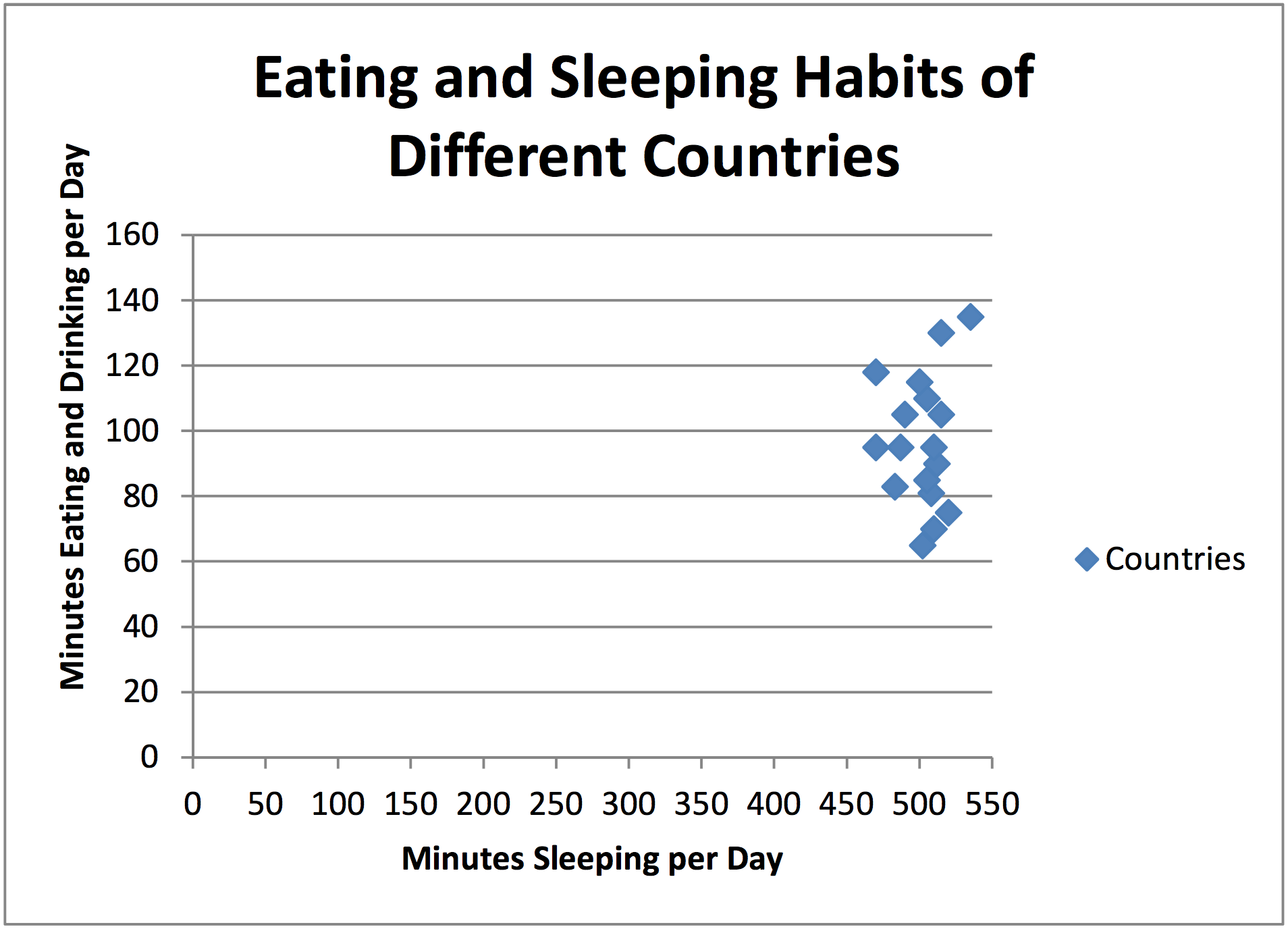
Each individual point on a scatter plot represents a single idea. For example, in the picture below each point represents a country. The axes tell us information about that country. The 1-axis tells us about how many minutes per day that country spends eating and drinking. The -axis tells us about how many minutes per day that country spends sleeping. Can you find the United States on this scatter plot? About how many minutes do we sleep per day? About how many minutes we spend eating and drinking per day? Are these numbers reasonable to you?

Image Source: http://www.visualquest.in/2010/09/severalsimple-and-very-useful.html
Another thing to notice about this scatter plot is that it uses the broken axis symbol (that little Z looking thing). This means that they don’t start counting from zero on either axis. They skip ahead to a reasonable starting point but still apply a scale after that point. Even with the broken axis they must count by something in each direction. In this case, they count by 20 minutes on the -axis and the 1-axis as well.
If we did not use the broken axis, it might look
more like the scatter plot below. To be able to label the
data points, it is useful in this case to use the broken axes.
Outliers
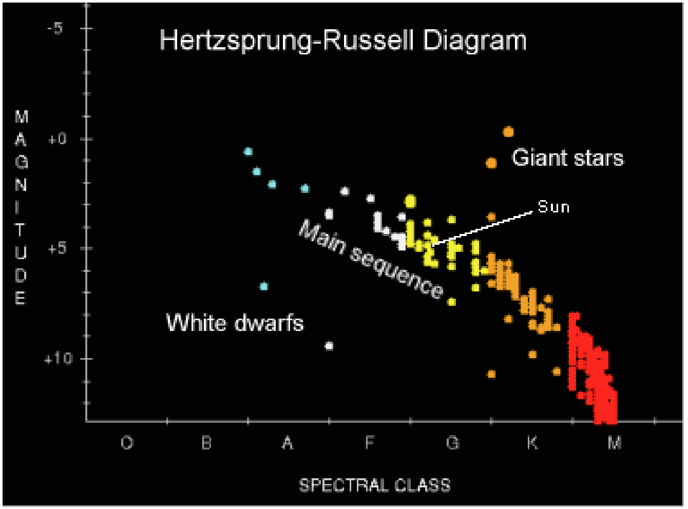
An outlier is a data point that is significantly far away from the majority of the data. There is no precise mathematical definition for what makes a data point an outlier. It’s usually somewhat obvious. For example, notice that White Dwarf Stars and Giant Stars are both outliers in the below scatter plot showing a star’s spectral class (temperature) versus its magnitude (brightness).
Why do we care about outliers? We
care because outliers often throw off the
analysis of the data set. For example, let’s say
you have three test grades in math class: 80%,
80%, and 80%. Your current class average is, you guessed it, 80%. However, if we throw in an outlier, like a 0%, for
the next test, your class average drops down to 60%. You have dropped two letter grades from a B- to a D-. Yikes!
The outlier sure hurt your grade.
Strength & Associations
An association, sometimes called a correlation, is a relationship between two data sets. For example, in the star scatter plot from the previous page, there appears to be a relationship between a star’s temperature and brightness. We’d have to know more about the science of stars to fully interpret the graph, but we can see there is an association because most of the data follows a pattern (except for those pesky outliers).
In fact, the more tightly clumped the data is, the stronger the association is. We might say that there is a strong association between the brightness and temperature of a star. In the scatter plot below, we see a slightly weaker association between scores on a practice exam and scores of the final exam.
We would also say that the scatter plot below has a positive association because it appears that the
students who scored higher on the practice exam also
scored higher on the final exam. As one variable
(practice exam score) increased, the other variable (final
exam score) also increased. We call this a positive
association.

Image Source: http://www.r-bloggers.com/r-tutorial-series-basic-polynomial-regression/
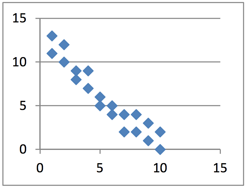
There are also negative associations. These associations are recognized by
the fact that as one variable increases, the other decreases. For example, as
the supply of oil increases, the cost of gasoline decreases. They have a
negative association. A scatter plot with a negative association might look
like the graph below.
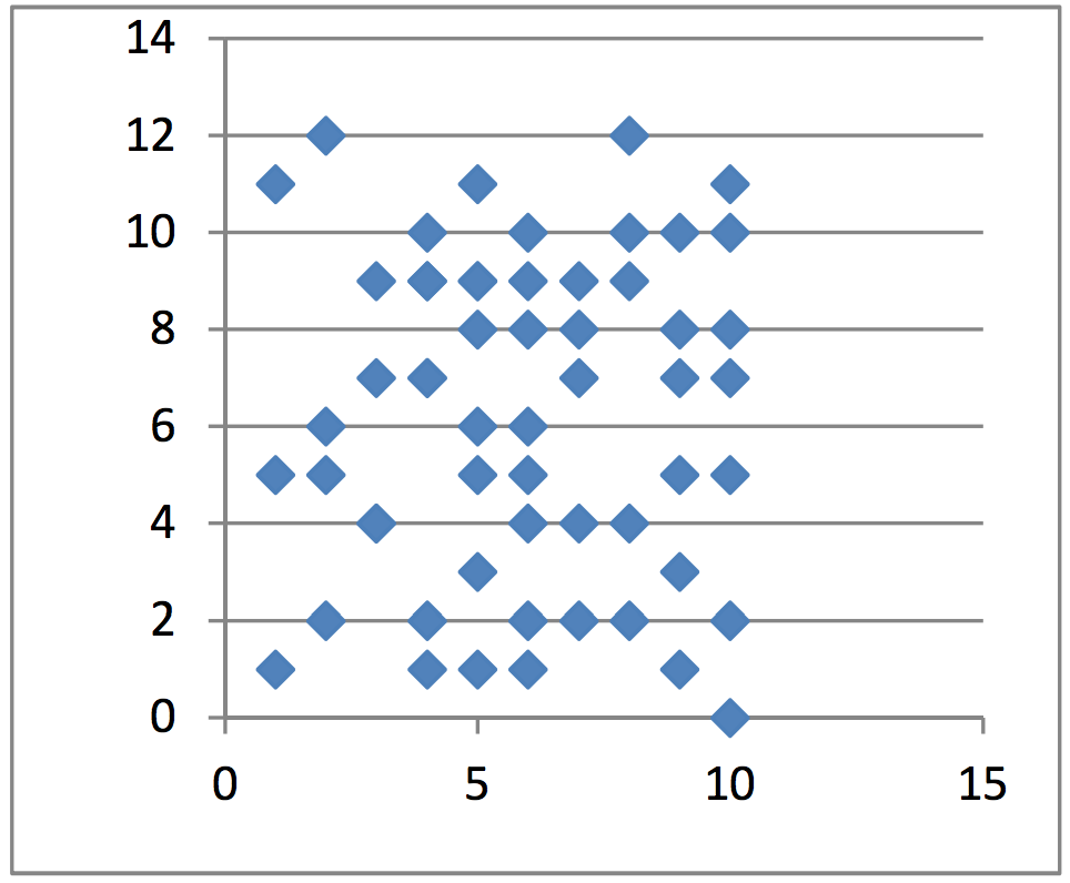
No association would mean that there appears to be no
relationship between the two data sets (or variables). For
example, we might consider the daily price of tea and the daily
number of fruit flies born. There is likely no relationship between
those two things which would produce a graph similar to the one
below.
Linearity
Whether the association is positive or negative, it may appear linear or non-linear. A linear association would be a scatter plot where the data points clump together around what appears to be a line. The scatter plots shown below are an example of a positive and negative linear association.


A non-linear association is usually curved to some extent.
There are many types of curves that it could fit, but we’ll just
focus on the fact that it doesn’t look a line and therefore is nonlinear.
Consider the graph below showing the relative risk
of an accident compared to the blood alcohol level. As you can
see, the graph curves sharply up when there is more alcohol in
the blood stream. This should not only serve as an example of
non-linear scatter plot, but also the risks of drinking and driving.
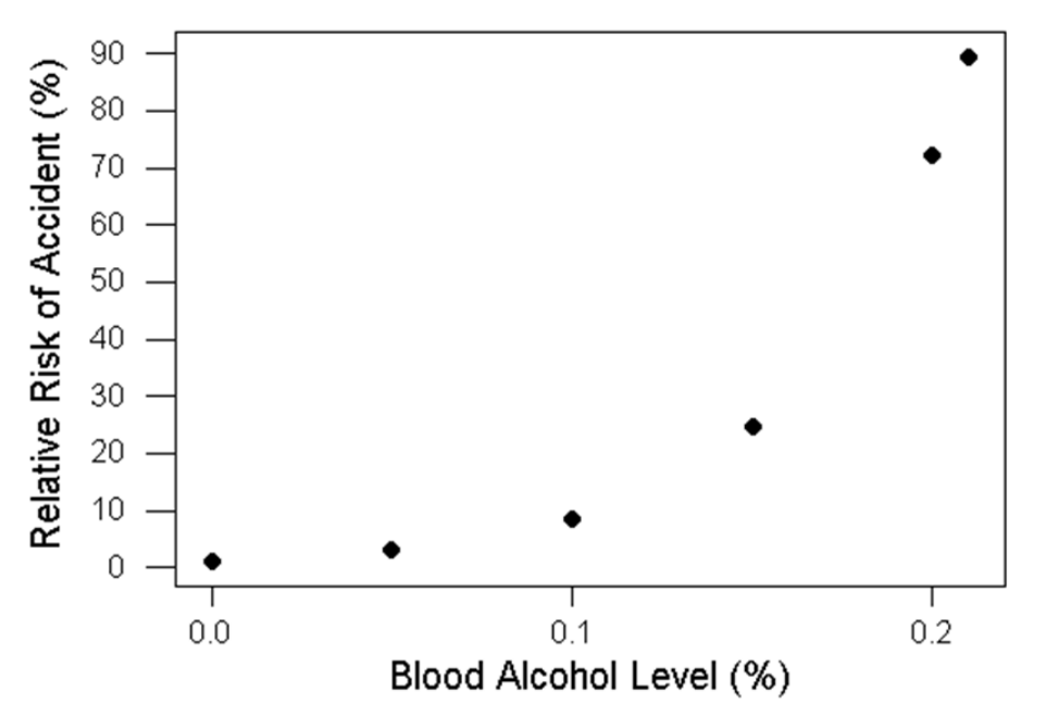
Image Source: http://wps.prenhall.com/esm_walpole_probstats_7/55/14203/3635978.cw/content/index.html
Clustering
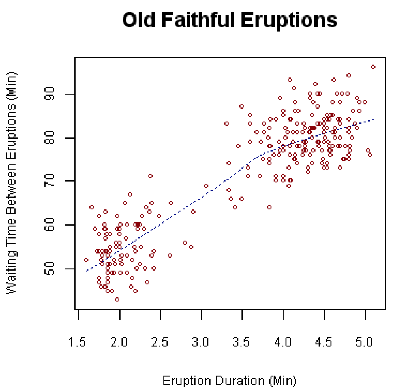
Clustering is when there is an
association, but it appears to come in
clumps. Consider the following scatter plot
that shows the time between eruptions and
eruption duration of Old Faithful. Notice
how the points cluster towards the lower left
and upper right. While this does show us a
positive association (meaning the longer
between eruptions, the longer the next
eruption will last), it also shows us that there
are not very many medium length eruptions.
They are either short eruptions with short
wait times or long eruptions with long wait
times.
