LESSON: Correlation
| Site: | Mountain Heights Academy OER |
| Course: | Introductory Statistics Q3 |
| Book: | LESSON: Correlation |
| Printed by: | Guest user |
| Date: | Friday, 25 July 2025, 4:36 PM |
Introduction to Correlation

Suppose a student wants to know whether a relationship exists between the number of hours he/she spends working on homework and their final grade.

Suppose a store owner wants to know whether a relationship exists between the amount of money spent in advertising and the store's income.

Or suppose a police officer wants to know whether a relationship exists between crime and graduation rates in an area.
How would each of these people determine if a relationship exists?
In this lesson, you learn how to describe what type of relationship, or correlation, exists between two quantitative variables.
Scatter Plots & Correlation
Last week, you learned how to create scatter plots to represent bivariate data. When we graph bivariate data on a scatter plot it becomes easier to determine the relationship that exists between the two variables. You learned how to recognize positive and negative correlations as well as linear and nonlinear correlations by looking at scatter plots. Take a minute to review these types of graphs.
Remember when constructing scatter plots, the independent variable (x) is measured by the horizontal axis and the dependent variable (y) is measured by the vertical axis.

Example
A doctor wanted to determine if there was a relationship between age (x) and the number of illnesses a person has per year (y). He gathered the data in the table shown below. Display the data on a scatter plot and determine whether there appears to be a positive or negative linear correlation or no correlation.

Solution: From the scatter plot, there appears to be a negative linear correlation. Reading the scatter plot from left to right, as age increases, the number of illnesses per year decreases.
Correlation Coefficient
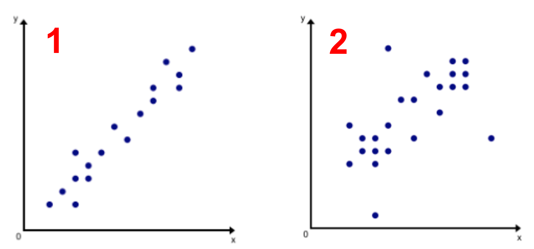
Interpreting correlation by visually assessing a scatter plot can be subjective. Take a look at the two scatter plots shown below. Both scatter plots appear to have a positive linear correlation, but the data in scatter plot 1 seems to have a much stronger positive correlation than the data in scatter plot 2. But how much stronger? How can we quantify the strength of a correlation?

A more precise way to measure the type (positive or negative) and strength of a linear correlation between two variables is to calculate the correlation coefficient. We use the variable r to represent the correlation coefficient.
The range of the correlation coefficient is from -1 to 1. Negative correlations will have negative r values. Positive correlations will have positive r values.
If the two variables have a perfect positive correlation, then the correlation coefficient will be r=1.
If the two variables have a perfect negative correlation, then the correlation coefficient will be r=-1.
If the two variables have absolutely no correlation, then the correlation coefficient will be r=0.
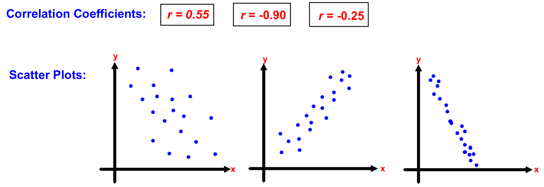
Several examples are shown below:

Correlation Interactive
Visit this web page to play with an interactive that demonstrates what different data sets look like with different correlations.

Calculating a Correlation Coefficient
So far, you've had practice estimating the correlation coefficient when given a set of choices.
Try it out! Can you correctly match the correlation coefficient with it's scatter plot?

It's easy enough to match the correlation coefficient to a scatter plot when you are given multiple choices. But how is the correlation coefficient calculated?
The correlation coefficient is calculated using the following formula, where x represents the x-values in the data set and y represents the y-values in the data set.

Looks a little tricky, right? It takes some time to use that formula by hand to come up with the correlation coefficient.
The good news is: I'm not going to make you calculate the correlation coefficient by hand! Continue on to the next lesson page to learn how to create scatter plots and calculate the correlation coefficient using Google Sheets.
Using Google Sheets
Watch this lesson video to learn how to use Google Sheets to create scatter plots and calculate the correlation coefficient for you.
Interpreting the Correlation Coefficient
We know how to calculate the correlation coefficient now. Great! But how should I interpret it?
Remember, the correlation coefficient tells me how STRONG or WEAK the relationship is between two variables. In our class, we will use the following scale for interpreting the correlation coefficient and the strength or weakness of a relationship between two variables.

On the last lesson page we calculated the correlation coefficient for shoe size versus height and found it to be: r = 0.75. Using the scale above, we would say that there is a STRONG correlation between height and shoe size. This means that we can strongly expect that the taller a person is in our class, the larger their shoe size.
Watch the video below to see a few more examples of interpreting the correlation coefficient using this scale: