LESSON: Graphing Quantitative Data
| Site: | Mountain Heights Academy OER |
| Course: | Introductory Statistics Q2 |
| Book: | LESSON: Graphing Quantitative Data |
| Printed by: | Guest user |
| Date: | Friday, 25 July 2025, 6:20 PM |
Dot Plots
In this video you'll see how you can represent quantitative data by constructing a Dot Plot. In this example we're graphing how many siblings a population has.
Stem & Leaf Plots
Another way to present quantitative data is by creating a Stem and Leaf Plot. In this video you'll see an example of how to do that. He doesn't say what his data represents, but let's assume they are test scores.
Histograms
A histogram is another way to graphically represent quantitative data. A histogram looks similar to a bar graph. In a histogram, the horizontal axis is labeled with our variable and the vertical axis is the frequency (how often each variable appears).
Box & Whisker Plots
This video gives a demonstration of how to construct a box and whisker plot with quantitative data.
If you'd like to see the steps for creating a box and whisker plot written out, you can view the steps below. These steps were taken from this website.
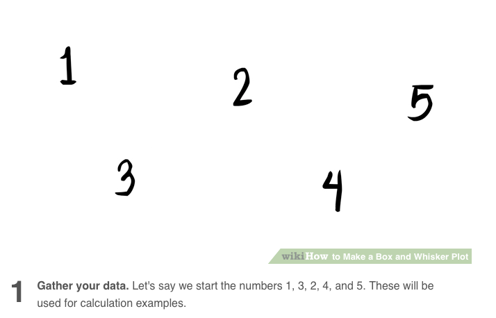
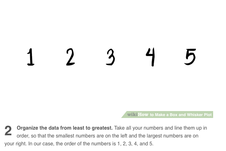


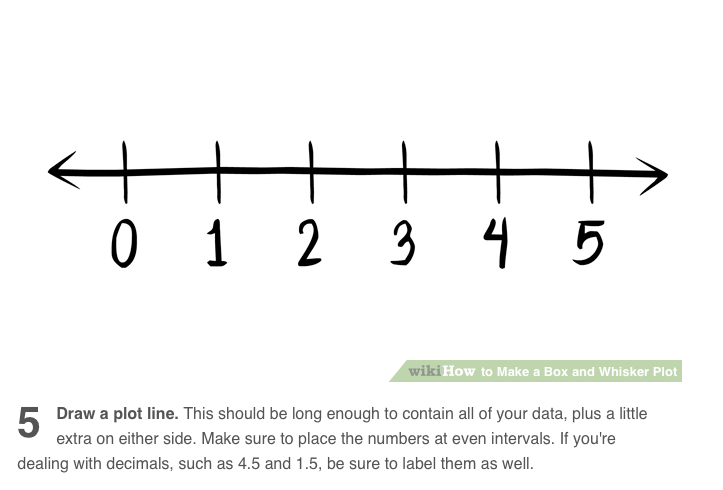

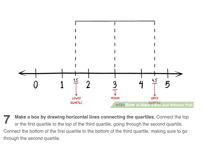
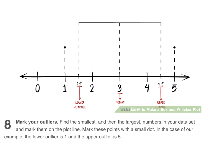
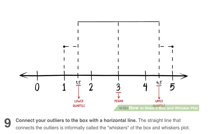

Box and Whisker Plot Step by Step Instructions Accessed From CC BY NC SA http://www.wikihow.com
Scatter Plots
A Scatter Plot is a great option when we want to graphically display bivariate data. Bivariate data just means that we have two variables that we are comparing. Watch the video to see an example.