LESSON: Measures of Spread
| Site: | Mountain Heights Academy OER |
| Course: | Introductory Statistics Q2 |
| Book: | LESSON: Measures of Spread |
| Printed by: | Guest user |
| Date: | Wednesday, 2 July 2025, 11:57 PM |
Measures of Spread
In the past lessons, we studied measures of center (mean, median, mode). Another important feature that can help us understand more about a data set is the manner in which the data are distributed, or spread. Variation and dispersion are words that are also commonly used to describe this feature. There are several commonly used statistical measures of spread that we will investigate in this lesson book.
This lesson book was compiled using:
Range
One measure of spread is the range. The range is simply the difference between the largest value (maximum) and the smallest value (minimum) in the data.
Example: Find the range of the data set shown below:
75, 80, 90, 94, 96
The range of this data set is
The range is useful because it requires very little calculation, and therefore, gives a quick and easy snapshot of how the data are spread. However, it is limited, because it only involves two values in the data set, and it is not resistant to outliers.
Interquartile Range
The interquartile range is the difference between the Q3 and Q1, and it is abbreviated IQR. Thus, IQR=Q3−Q1. The IQR gives information about how the middle 50% of the data are spread. Fifty percent of the data values are always between Q3 and Q1.Example: A recent study proclaimed Mobile, Alabama the wettest city in America. (Source: http://www.livescience.com/environment/070518_rainy_cities.html.) The following table lists measurements of the approximate annual rainfall in Mobile over a 10 year period.
Find the range and IQR for this data.
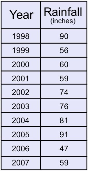
First, place the data in order from smallest to largest.
To find the

The
Variance & Standard Deviation
The standard deviation is an extremely important measure of spread that is based on the mean. Recall that the mean (represented by $${\bar{x}}$$ and pronounced "x bar") is the numerical balancing point of the data. One way to measure how the data are spread is to look at how far away each of the values is from the mean. The difference between a data value and the mean is called the deviation. Written symbolically, it would be as follows:
$$Deviation = x - \bar{x}$$
Let’s take the simple data set of three randomly selected individuals’ shoe sizes shown below:
9.5 11.5 12
The mean of this data set is 11. The deviations are as follows:
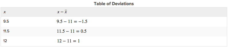
Notice that if a data value is less than the mean, the deviation of that value is negative. Data points that are greater than the mean have positive deviations.
The standard deviation is a measure of the typical, or average, deviation for all of the data points from the mean. However, the very property that makes the mean so special also makes it tricky to calculate a standard deviation. Because the mean is the balancing point of the data, when you add the deviations, they always sum to 0.
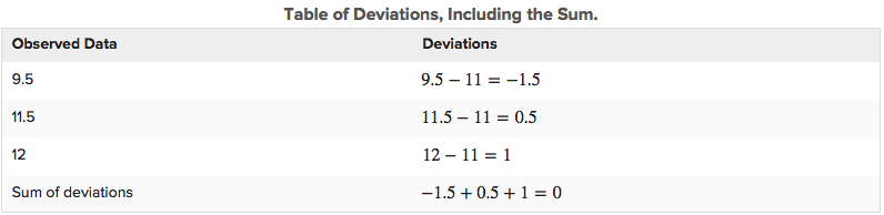
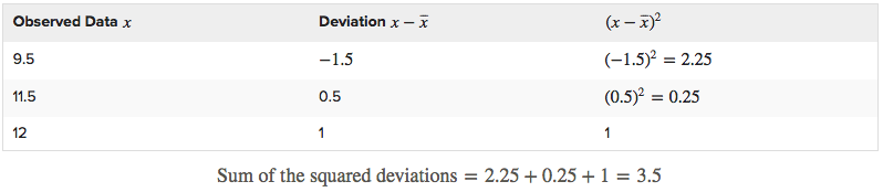
We want to find the average of the squared deviations. To find an average, you usually divide by the number of data points in your set, n. If we were finding the standard deviation for an entire population then we would divide by n. However, in this example, we are only working with a sample of a population, so we will divide by n - 1. Since n = 3, you will divide 3.5 by 2.
The result, which is called the variance, is $$3.5/2=1.75$$. The variance of a sample is denoted by $$s^{2}$$ or the Greek letter $$\sigma^{2}$$ and is a measure of how closely the data are clustered around the mean. Because we squared the deviations before we added them, the units we were working in were also squared.
To return to the original units, we must take the square root of our result: $$\sqrt{1.75}=1.32$$.
This quantity is the standard deviation and is denoted by
A small standard deviation means that the data points are clustered close to the mean, while a large standard deviation means that the data points are spread out from the mean.
Measures of Spread Video
Now that you've been introduced to the different measures of spread, it will be helpful for you to see a video example of how these calculations are used.
In this video you'll be shown two different data sets. Then you will see how the mean, range, variance and standard deviation are calculated for each data set. Keep in mind that in these examples, he is calculating the standard deviation for the population, rather than a sample like you read about on the last page. There is one small difference to the calculation for the standard deviation of a population vs. a sample. Can you spot what it is?
I want you to have an understanding of how variance and standard deviation are calculated, but please note that you will not be required to calculate them by hand in our course.
Visualize Spread
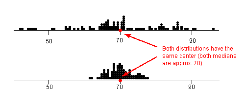
Take a look at the dot plots in the image below. This image will help you visualize "spread" in data sets.
The dot plots shown are a record of student test scores in a certain class. Both dot plots have approximately the same mean and median, around 70. But notice that the top dot plot's data points are much more spread out. Therefore, the top dot plot would have a larger range, IQR, variance and standard deviation than the bottom dot plot.
Remember that standard deviation is a measure of how close the data points are to the mean. It makes sense then that the bottom dot plot would have a lower standard deviation than the top dot plot since it's data points are closely bunched together.