LESSON: Interpreting Scatter Plots
Reading Data Points
Each individual point on a scatter plot represents a single idea. For example, in the picture below each point represents a country. The axes tell us information about that country. The 1-axis tells us about how many minutes per day that country spends eating and drinking. The -axis tells us about how many minutes per day that country spends sleeping. Can you find the United States on this scatter plot? About how many minutes do we sleep per day? About how many minutes we spend eating and drinking per day? Are these numbers reasonable to you?

Image Source: http://www.visualquest.in/2010/09/severalsimple-and-very-useful.html
Another thing to notice about this scatter plot is that it uses the broken axis symbol (that little Z looking thing). This means that they don’t start counting from zero on either axis. They skip ahead to a reasonable starting point but still apply a scale after that point. Even with the broken axis they must count by something in each direction. In this case, they count by 20 minutes on the -axis and the 1-axis as well.
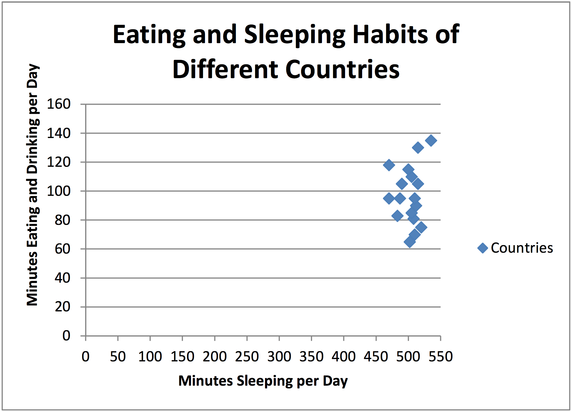
If we did not use the broken axis, it might look
more like the scatter plot below. To be able to label the
data points, it is useful in this case to use the broken axes.
