LESSON: Interpreting Scatter Plots
Strength & Associations
An association, sometimes called a correlation, is a relationship between two data sets. For example, in the star scatter plot from the previous page, there appears to be a relationship between a star’s temperature and brightness. We’d have to know more about the science of stars to fully interpret the graph, but we can see there is an association because most of the data follows a pattern (except for those pesky outliers).
In fact, the more tightly clumped the data is, the stronger the association is. We might say that there is a strong association between the brightness and temperature of a star. In the scatter plot below, we see a slightly weaker association between scores on a practice exam and scores of the final exam.
We would also say that the scatter plot below has a positive association because it appears that the
students who scored higher on the practice exam also
scored higher on the final exam. As one variable
(practice exam score) increased, the other variable (final
exam score) also increased. We call this a positive
association.

Image Source: http://www.r-bloggers.com/r-tutorial-series-basic-polynomial-regression/
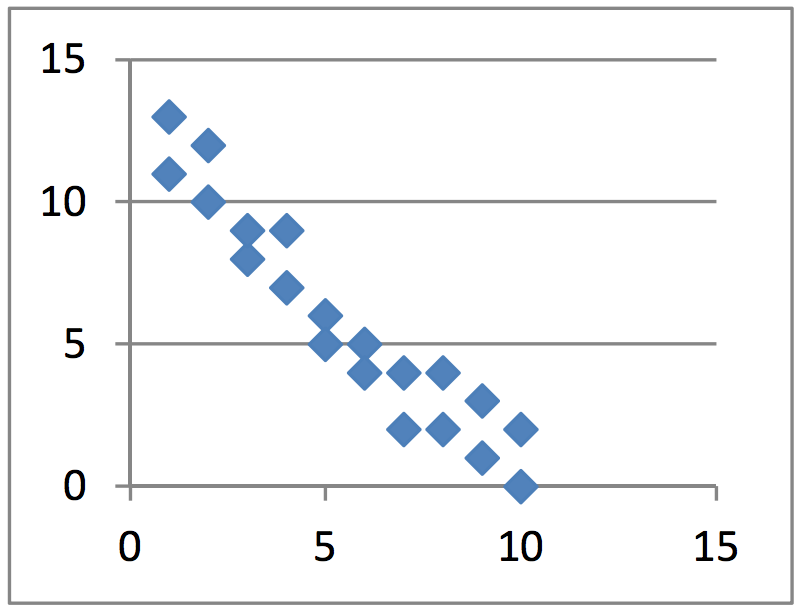
There are also negative associations. These associations are recognized by
the fact that as one variable increases, the other decreases. For example, as
the supply of oil increases, the cost of gasoline decreases. They have a
negative association. A scatter plot with a negative association might look
like the graph below.

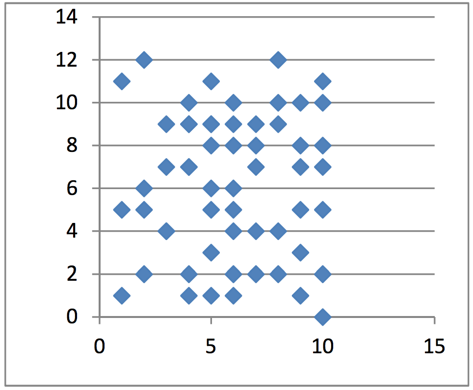
No association would mean that there appears to be no
relationship between the two data sets (or variables). For
example, we might consider the daily price of tea and the daily
number of fruit flies born. There is likely no relationship between
those two things which would produce a graph similar to the one
below.
