LESSON: Measures of Spread
Completion requirements
Visualize Spread
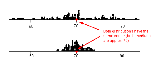
Take a look at the dot plots in the image below. This image will help you visualize "spread" in data sets.
The dot plots shown are a record of student test scores in a certain class. Both dot plots have approximately the same mean and median, around 70. But notice that the top dot plot's data points are much more spread out. Therefore, the top dot plot would have a larger range, IQR, variance and standard deviation than the bottom dot plot.
Remember that standard deviation is a measure of how close the data points are to the mean. It makes sense then that the bottom dot plot would have a lower standard deviation than the top dot plot since it's data points are closely bunched together.